When you bootstrap an Ionic application with the Ionic CLI, you automatically have access to the Ionicons library, a collection of SVG icons for web, iOS, and Android development. The library isn't that large, and you usually add icons from other sources to your project. I showed you how to add individual SVGs in my previous blog post.
In this blog post, we will look at another icon library, FontAwesome, and how to add it to your Ionic application.
FontAwesome provides free, open-source libraries for a variety of JavaScript front-end frameworks, like Vue.js, React, Angular, Ember and more. In this blog post, I focus on the Angular library.
Setup 
To add FontAwesome to your project, you have to install the core library, one or more icon libraries, and lastly, the Angular integration library.
npm install @fortawesome/fontawesome-svg-core

npm install @fortawesome/free-brands-svg-icons
npm install @fortawesome/free-regular-svg-icons
npm install @fortawesome/free-solid-svg-icons

npm install @fortawesome/angular-fontawesome
The free version of FontAwesome gives your project access to a subset of icons. You only have access to the libraries above (brands, regular, solid). Visit the gallery to see which icons are free and which ones are part of the pro version.
If you want to use icons from the pro set, you first have to buy a license.
Usage 
The Angular FontAwesome library provides two ways to import icons into your application.
Explicit reference 
In this mode, you import the icons in the component TypeScript code, create an instance variable, and reference this variable from the template.
Import the icons you want to use in your template.
import {faHandPointLeft, faHandPointRight} from '@fortawesome/free-regular-svg-icons';
Create an instance variable
  faHandPointLeft = faHandPointLeft;
  faHandPointRight = faHandPointRight;
Reference the instance variables with the fa-icon component.
  <ion-button>
    <fa-icon [icon]="faHandPointLeft" slot="start"></fa-icon>
    Left Icon
  </ion-button>

  <ion-button>
    Right Icon
    <fa-icon [icon]="faHandPointRight" slot="end"></fa-icon>
  </ion-button>

Library 
The previous approach works fine if you only reference an icon from one component. As soon as you start using icons in multiple components, this approach is not that convenient.
Instead of registering the icons per component, you can add them to a library. This way, all these icons are available to any other component. The downside is that the icons are managed separately from the component. If someone accidentally deletes an icon from the library, a component that references this icon could break.
Import the icons you need for your application.
import {
  faAsterisk,
  faBan,
  faBell as faSolidBell,
  faCamera,
  faCircle,
  faCloud,
  faCog,
  faEnvelopeOpen,
  faHandPointLeft,
  faMobile,
  faMoon,
  faPlay,
  faSkating,
  faSkiing,
  faSkiingNordic,
  faSmileBeam as faSmileBeanSolid,
  faSmileWink as faSmileWinkSolid,
  faSnowboarding,
  faSpinner,
  faSquare,
  faStar,
  faSun,
  faSwimmer,
  faSync
} from '@fortawesome/free-solid-svg-icons';
import {faBell as faRegularBell, faSmileBeam, faSmileWink} from '@fortawesome/free-regular-svg-icons';
Instead of individually importing each icon, you can import an entire icon pack.
// import {fas} from '@fortawesome/free-solid-svg-icons';
This can make sense if you use many icons from the same icon pack.
Next, inject the FaIconLibrary service into your code.
private readonly library = inject(FaIconLibrary);
Add the icons to the library with addIconPacks() or addIcons().
    // library.addIconPacks(fas);
    this.library.addIcons(faSmileWinkSolid, faSmileBeanSolid,
      faSmileWink, faSmileBeam, faEnvelopeOpen, faCloud,
      faMobile, faSquare, faSpinner, faCircle,
      faSync, faPlay, faSun, faMoon, faStar,
      faHandPointLeft, faAsterisk, faCog, faSkating,
      faSkiing, faSkiingNordic, faSnowboarding, faSwimmer,
      faSolidBell, faRegularBell, faCamera, faBan);
In the template, you access these icons by name.
Notice that the name is different from the name from the import statement.
You can derive the name by removing the fa prefix and replacing camelCase with dashes.
For example: faSmileWink becomes smile-wink.
The gallery page also tells you the name.
    <fa-icon icon="smile-wink"></fa-icon>
    <fa-icon icon="smile-beam"></fa-icon>
By default, specifying only the name references the icons from the solid library (fas). To reference
icons from other libraries, you have to specify the prefix.
    <fa-icon [icon]="['far', 'smile-wink']"></fa-icon>
    <fa-icon [icon]="['far', 'smile-beam']"></fa-icon>

Supported prefixes:
far= regularfas= solidfal= lightfab= brands
You may change the default prefix (fas) if you have to reference more icons from a different icon set than the default fas.
To change the default, inject FaConfig and assign the new default to the defaultPrefix property.
import {FaConfig} from '@fortawesome/angular-fontawesome';
export class AppComponent {
  private readonly config = inject(FaConfig);
  constructor() {
      this.config.defaultPrefix = 'far';
  }
}
Features 
The Angular FontAwesome library supports many options to transform and combine icons.
The following code shows you how to resize, rotate, and flip icons.
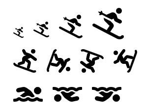
    <fa-icon [icon]="['fas', 'skiing']" size="lg"></fa-icon>
    <fa-icon [icon]="['fas', 'skiing']" size="2x"></fa-icon>
    <fa-icon [icon]="['fas', 'skiing']" size="3x"></fa-icon>
    <fa-icon [icon]="['fas', 'skiing']" size="4x"></fa-icon>
    <fa-icon [icon]="['fas', 'snowboarding']" size="3x"></fa-icon>
    <fa-icon [icon]="['fas', 'snowboarding']" [rotate]="90" size="3x"></fa-icon>
    <fa-icon [icon]="['fas', 'snowboarding']" [rotate]="180" size="3x"></fa-icon>
    <fa-icon [icon]="['fas', 'snowboarding']" [rotate]="270" size="3x"></fa-icon>
    <fa-icon [icon]="['fas', 'swimmer']" flip="horizontal" size="3x"></fa-icon>
    <fa-icon [icon]="['fas', 'swimmer']" flip="vertical" size="3x"></fa-icon>
    <fa-icon [icon]="['fas', 'swimmer']" flip="both" size="3x"></fa-icon>
It's also easy to add bindings to any directive and dynamically do transformations.
    <fa-icon [icon]="['fas', 'hand-point-left']" size="5x" transform="rotate-{{magicLevel}}"></fa-icon>
    <input (input)="updateMagicLevel($event)" [value]="magicLevel" max="360" min="0" type='range'/>

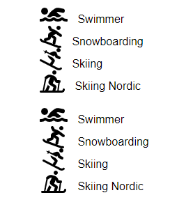
If you need to align a bunch of icons vertically, you can set the directive fixedWidth to true, and the library enforces that all icons have the same width.
    <ul>
      <li>
        <fa-icon [fixedWidth]="true" [icon]="['fas', 'swimmer']" size="2x"></fa-icon>
        Swimmer
      </li>
      <li>
        <fa-icon [fixedWidth]="true" [icon]="['fas', 'snowboarding']" size="2x"></fa-icon>
        Snowboarding
      </li>
      <li>
        <fa-icon [fixedWidth]="true" [icon]="['fas', 'skiing']" size="2x"></fa-icon>
        Skiing
      </li>
      <li>
        <fa-icon [fixedWidth]="true" [icon]="['fas', 'skiing-nordic']" size="2x"></fa-icon>
        Skiing Nordic
      </li>
    </ul>
The following picture shows you the difference. The first four icons use their normal width. The other four icons have their width aligned with fixedWidth.
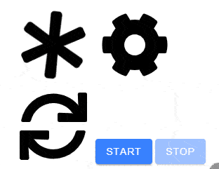
The library also supports a spin and pulse animation. These work exceptionally well with icons from the spinners category.
    <fa-icon [icon]="['fas', 'asterisk']" animation="spin" size="6x"></fa-icon>
    <fa-icon [icon]="['fas', 'cog']" animation="spin-pulse" size="6x"></fa-icon>
    <fa-icon [animation]="syncRunning ? 'spin' : undefined" [icon]="['fas', 'sync']" size="6x"></fa-icon>
    <ion-button (click)="syncRunning = true" [disabled]="syncRunning">Start</ion-button>
    <ion-button (click)="syncRunning = false" [disabled]="!syncRunning">Stop</ion-button>
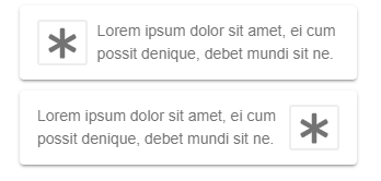
The border directive draws a border around the icon. If you need to wrap text around icons, the pull directive helps with that use case.
  <ion-card>
    <ion-card-content>
      <fa-icon [border]="true" [icon]="['fas', 'asterisk']" pull="left" size="2x"></fa-icon>
      Lorem ipsum dolor sit amet, ei cum possit denique, debet mundi sit ne.
    </ion-card-content>
  </ion-card>

  <ion-card>
    <ion-card-content>
      <fa-icon [border]="true" [icon]="['fas', 'asterisk']" pull="right" size="2x"></fa-icon>
      Lorem ipsum dolor sit amet, ei cum possit denique, debet mundi sit ne.
    </ion-card-content>
  </ion-card>
With Mask, an application can
combine two icons and create one single-color shape.
Transform allows you to scale, position, flip, and rotate icons arbitrarily.
<fa-icon [icon]="['fas', 'swimmer']" [mask]="['fas', 'circle']" size="6x" transform="shrink-10 down-4"></fa-icon>
Stacking allows you to easily stack multiple icons on top of each other.
    <fa-stack size="5x">
      <fa-icon [icon]="['fas', 'camera']" stackItemSize="1x"></fa-icon>
      <fa-icon [icon]="['fas', 'ban']" stackItemSize="2x" style="color:Tomato"></fa-icon>
    </fa-stack>

While stacking puts the icons on top of each other, layering gives you even more control over placing multiple icons and text on top of each other.
    <fa-layers size="6x">
      <fa-icon [icon]="['fas', 'play']" transform="rotate--90 grow-2"></fa-icon>
      <fa-icon [icon]="['fas', 'sun']" [inverse]="true" transform="shrink-10 up-2"></fa-icon>
      <fa-icon [icon]="['fas', 'moon']" [inverse]="true" transform="shrink-11 down-4.2 left-4"></fa-icon>
      <fa-icon [icon]="['fas', 'star']" [inverse]="true" transform="shrink-11 down-4.2 right-4"></fa-icon>
    </fa-layers>

    <fa-layers size="5x">
      <fa-icon [icon]="['fas', 'cloud']"></fa-icon>
      <fa-layers-text content="Cloud" style="color: white;" transform="shrink-12"></fa-layers-text>
    </fa-layers>

    <fa-layers size="5x">
      <fa-icon [icon]="['fas', 'envelope-open']"></fa-icon>
      <fa-layers-counter content="5"></fa-layers-counter>
    </fa-layers>

With the [styles] directive, you can control all kinds of properties of the SVG. This directive
works similarly to the [ngStyle] directive and allows you to bind properties from the TypeScript code dynamically.
    <fa-icon [icon]="['fas', 'bell']" [style]="dynamicStyle()" size="5x"></fa-icon>
    <fa-icon [icon]="['far', 'bell']"
             [style]="{'color': color, 'stroke': stroke, 'stroke-width': strokeWidth + 'px', 'opacity': opacity}"
             size="5x"></fa-icon>
  color = 'red';
  stroke = 'red';
  strokeWidth = 0;
  opacity = '1';

  private interval!: any;

  ngOnDestroy(): void {
    clearInterval(this.interval);
  }

  ngOnInit(): void {
    this.interval = setInterval(() => {
      this.color = this.randomColor();
      this.stroke = this.randomColor();
      this.strokeWidth = this.randomWidth();
      this.opacity = '' + Math.random();
    }, 1000);
  }

  dynamicStyle(): { color: string; 'stroke-width': string; opacity: string; stroke: string } {
    return {
      opacity: '' + Math.random(),
      color: this.randomColor(),
      stroke: this.randomColor(),
      'stroke-width': this.randomWidth() + 'px'
    };
  }

This concludes this tutorial about FontAwesome and the Angular library. Visit the project page for more in-depth and up to date information.
The source code for the examples in this blog post is hosted on GitHub:
https://github.com/ralscha/blog2019/tree/master/fa