In this blog post, I'll show you how to set up a project from scratch with Angular and the Nebular component library. The Nebular library contains over 35 Angular components and provides four built-in customizable themes. The library is released under the MIT license, and the source code is hosted on GitHub.
The following tutorial assumes that you have already installed the necessary tools for Angular development, notably Node.js and the Angular CLI. If you are starting from scratch, follow the steps in the Angular Getting Started guide.
Bootstrap 
To bootstrap an Angular application, execute the ng new command. The following command creates a new project, nebular-start, with Angular routing support and Sass as the stylesheet language.
ng new nebular-start --routing=true --style=scss
Next, add Nebular to the new project:
ng add @nebular/theme
This command will ask you what Nebular theme you want to install. You can always change this later. For now, choose the "default" theme. Next, the command asks if it should install customizable scss themes, enter y. When you install customizable scss themes, you can customize the themes later. Also, enter y for setting up the browser animation.
The ng add command installs the required Nebular packages (@angular/cdk, @nebular/theme, and eva-icons).
The add command also creates the file src/themes.scss and updates the existing files src/app/app.module.ts, src/styles.scss, and src/app/app.component.html.
In src/app/app.module.ts, the add command inserted code into the imports section that loads the Nebular modules.
  imports: [
    BrowserModule,
    AppRoutingModule,
    BrowserAnimationsModule,
    NbThemeModule.forRoot({ name: 'default' }),
    NbLayoutModule,
    NbEvaIconsModule
  ],
In src/app/app.component.html, ng add added the following code. This creates a standard header/main content/footer layout.
<nb-layout>

  <nb-layout-header fixed>
  <!-- Insert header here -->
  </nb-layout-header>

  <nb-layout-column>
    <router-outlet></router-outlet>
  </nb-layout-column>

  <nb-layout-footer fixed>
  <!-- Insert footer here -->
  </nb-layout-footer>

</nb-layout>
Note that I removed the HTML code, except <router-outlet></router-outlet>, that ng new created.
Start the application with ng serve -o.
Instead of using ng add, you can also install Nebular manually. Follow the steps outlined in this tutorial.
Content 
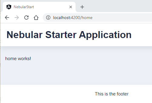
In this section, we add some content to the header, footer, and main area. Open src/app/app.component.html and add a header and a footer.
<nb-layout>

  <nb-layout-header fixed>
    <h2>Nebular Starter Application</h2>
  </nb-layout-header>

  <nb-layout-column>
    <router-outlet></router-outlet>
  </nb-layout-column>

  <nb-layout-footer fixed>
    This is the footer
  </nb-layout-footer>

</nb-layout>
The fixed attribute makes the header stick to the top of the page, and the footer stick to the bottom of the page. To learn more about Nebular's layout system, visit the official documentation.
Next, create a Home component. This component will be displayed with the help of <router-outlet> in the main content area of the screen (<nb-layout-column>).
ng generate component Home --skip-selector
The component does not need a selector, because Angular loads it with the router.
Open src\app\app-routing.module.ts and add the following route.
const routes: Routes = [
  {
    path: 'home',
    component: HomeComponent
  },
  {path: '', redirectTo: 'home', pathMatch: 'full'},
  {path: '**', redirectTo: 'home'},
];
This tells Angular to show the HomeComponent when the user enters the path /home. The two redirect rules redirect to /home when the path is either / or an unknown path like /xy.
Test the application with ng serve.
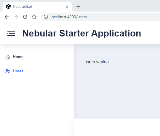
Sidebar 
A sidebar menu is a common UI element, and Nebular supports this user interface pattern with the sidebar component and menu component.
Nebular is a modular library, and before you can use any Nebular component, you need to import them into the application.
Open src\app\app.module.ts and import the icon, sidebar, and menu modules.
import {NbIconModule, NbLayoutModule, NbMenuModule, NbSidebarModule, NbThemeModule} from '@nebular/theme';

  imports: [
    BrowserModule,
    AppRoutingModule,
    BrowserAnimationsModule,
    NbIconModule,               // <---------
    NbSidebarModule.forRoot(),  // <---------
    NbMenuModule.forRoot(),     // <---------
    NbThemeModule.forRoot({name: 'default'}),
    NbLayoutModule,
    NbEvaIconsModule
  ],
Open src\app\app.component.html and insert the following code.
<nb-layout>

  <nb-layout-header fixed>
    <nb-icon (click)="toggleSidebar()" class="sidebar-toggle" icon="menu-2-outline"></nb-icon>
    <h2>Nebular Starter Application</h2>
  </nb-layout-header>

  <nb-sidebar class="menu-sidebar" responsive start>
    <nb-menu [items]="items"></nb-menu>
  </nb-sidebar>

  <nb-layout-column>
    <router-outlet></router-outlet>
  </nb-layout-column>

  <nb-layout-footer fixed>
    This is the footer
  </nb-layout-footer>

</nb-layout>
In the header, we insert an icon with <nb-icon> so the user can toggle, i.e., show and hide the sidebar. <nb-sidebar> adds the sidebar to the page. With the responsive attribute, the sidebar listens for window size changes and changes its size accordingly. On smaller screens, the sidebar is automatically hidden.
The start attribute places the sidebar in this application to the left of the layout. This depends on the text writing directionality, left-to-right, or right-to-left. See the MDN documentation about the dir attribute for more information.
The sidebar component can also be configured to show the sidebar above the main content or push the layout when opened. Visit the Nebular documentation for more information.
Add the following styles to src\app\app.component.scss to style the sidebar toggle icon.
.sidebar-toggle {
  padding-right: 1.25rem;
  text-decoration: none;
  color: var(--text-hint-color);
  font-size: 3.5rem;
}
To make the toggle icon work, add the following code to src\app\app.component.ts.
  constructor(private readonly sidebarService: NbSidebarService) {
  }

  toggleSidebar(): boolean {
    this.sidebarService.toggle();
    return false;
  }
NbSidebarService is a root module service to control the sidebar programmatically.
Menu 
Inside the sidebar, we want to show a menu. You already installed the corresponding module, NbMenuModule, in the previous section.
First, create a second component, so we can test if the menu works.
ng generate module users --route users --module app.module
This creates a lazy-loaded feature module. Angular does not bundle code for this component with the main module; instead, it creates a separate file that will be lazy-loaded the first time the user clicks on the menu.
To display the menu, add <nb-menu> to the template and specify the menu items with the [items] property. The items property expects an array of NbMenuItem objects.
Open src\app\app.component.ts and add the following code.
export class AppComponent {
  items: NbMenuItem[] = [
    {
      title: 'Home',
      icon: 'home-outline',
      link: '/home',
      home: true
    },
    {
      title: 'Users',
      icon: 'people-outline',
      link: '/users'
    }
The menu component supports two-level menus and auto-collapse menus. You can specify the location with either link, which uses the Angular router, or url, which goes directly into the href attribute.
A menu can display an icon, and it can be hidden. Query parameters can be passed to the link with queryParams. You can also specify target if you use url. Check out the documentation for more information.
The icons used here come from the eva-icons package, which is automatically included and configured by the ng add command.
Visit the project page to see a list of all included icons.
You can also control the menu programmatically by injecting NbMenuService.
NbMenuService provides a method navigateHome(), which navigates to the menu with the property home. If you use this feature, make sure that only one of your menus has this property set to true.
With the sidebar and menu code in place, test the application with ng serve.
Application loading spinner 
If you have a larger web application, it can take a few seconds until the JavaScript and CSS are loaded. To indicate to the user that something is happening, web applications often display a spinner animation.
To add a spinner to your new Nebular application, open src\index.html and insert the spinner code below <app-root></app-root>.
This example uses a spinner from the SpinKit project.
<app-root></app-root>
<div class="sk-container" id="nb-global-spinner">
  <div class="sk-chase">
    <div class="sk-chase-dot"></div>
    <div class="sk-chase-dot"></div>
    <div class="sk-chase-dot"></div>
    <div class="sk-chase-dot"></div>
    <div class="sk-chase-dot"></div>
    <div class="sk-chase-dot"></div>
  </div>
</div>
You can find the corresponding CSS code here.
It is important that you give the spinner element the id nb-global-spinner. Nebular automatically removes the element with this id when the application has been loaded.
Theme 
Nebular provides the following four built-in themes:
default- clean white themedark- dark themecosmic- alternative dark violet themecorporate- firm business theme
The themes are implementations of the Eva Design System.
Use a built-in theme 
The application we built before uses the default theme. To switch to another of the built-in themes, open the file src\themes.scss, import and register the theme.
This code changes the theme to dark.
@import '~@nebular/theme/styles/theming';
@import '~@nebular/theme/styles/themes/dark';

$nb-themes: nb-register-theme((
), dark, dark);
Open src\app\app.module.ts and change the theme name.
NbThemeModule.forRoot({name: 'dark'}),
The new theme is now active.
Customize a built-in theme 
You will hardly ever use a built-in theme unchanged. You can customize a theme in src\themes.scss. Inside the nb-register-theme Sass function, adjust the theme variables.
The following code uses the default theme and overrides the primary colors.
@import '~@nebular/theme/styles/theming';
@import '~@nebular/theme/styles/themes/default';

$nb-themes: nb-register-theme((
  color-primary-100: #FFFACC,
  color-primary-200: #FFF499,
  color-primary-300: #FFEC66,
  color-primary-400: #FFE43F,
  color-primary-500: #FFD700,
  color-primary-600: #DBB500,
  color-primary-700: #B79400,
  color-primary-800: #937500,
  color-primary-900: #7A5F00,
), default, default);
A convenient way to change colors is to open the Eva Design color generator, adjust the colors, click on Export and export the theme as a Nebular theme. You can then copy and paste the content of the exported file into src\themes.scss.
You can find the list of all supported theme variables in the official documentation.
Multiple themes 
Modern web applications often give the user the option to switch between multiple themes or automatically use a dark or light theme based on the user preference.
If you want to use multiple themes in a Nebular application, import and register them in src\themes.scss. In this example, we load the default and dark themes.
@forward '@nebular/theme/styles/theming';
@use '@nebular/theme/styles/theming' as *;
@use '@nebular/theme/styles/themes/default';
@use '@nebular/theme/styles/themes/dark';

$nb-themes: nb-register-theme(
    (
      // some styles we changed
      text-basic-color: color-basic-800,
      text-disabled-color: color-basic-600
    ),
    default,
    default
);

$nb-themes: nb-register-theme(
    (
      // some styles we changed
      text-basic-color: color-basic-800,
      text-disabled-color: color-basic-600
    ),
    dark,
    dark
);
For an automatic switch, we can now insert this code in src\app\app.module.ts.
NbThemeModule.forRoot({name: window.matchMedia('(prefers-color-scheme: dark)').matches ? 'dark' : 'default'}),
Depending on the setting in the operating system, your Nebular application will use the dark or default theme. On Windows 10, you can find the setting in Settings -> Personalization -> Colors -> Choose your default app mode. On macOS, choose Apple menu -> System Preferences -> click General, then select one of the Appearance options at the top of the window.
You can programmatically change a theme. Inject the NbThemeService and call changeTheme().
 constructor(private readonly themeService: NbThemeService) {
 }

 changeTheme() {
   this.themeService.changeTheme('dark');
 }
Your application can listen to theme changes with NbThemeService.onThemeChange().
 constructor(themeService: NbThemeService) {
   themeService.onThemeChange().subscribe(theme => console.log(`Theme changed to ${theme.name}`));
 }
CSS custom properties (CSS variables) 
You can instruct Nebular to use CSS custom properties. The benefit is that a theme can be changed without the need to reload the page. Moreover, no additional CSS is loaded, resulting in good performance. The drawback is that CSS custom properties are not supported in older browsers, notably IE11.
To enable CSS custom properties, set $nb-enable-css-custom-properties to true in the src\themes.scss file.
@import '~@nebular/theme/styles/theming';
@import '~@nebular/theme/styles/themes/default';

$nb-enable-css-custom-properties: true;

$nb-themes: nb-register-theme((
), default, default);
Visit the documentation to learn more.
Use Theme Variable 
When you create custom components and need access to theme variables, import theme.scss into the component Sass file and call the Sass function nb-theme with the name of the key variable as the argument.
@import '../../themes';

:host {
  background: nb-theme(background-basic-color-1);
}
Alternatively, when CSS custom properties are enabled, use var. In this case, you don't have to import theme.scss.
:host {
  background: var(--background-basic-color-1);
}
Create a new theme 
If you want to create a new theme, use the nb-register-theme Sass function and specify the name of the new theme (2nd argument) and the parent theme (3rd argument). The new theme inherits everything from the parent theme.
This example creates a theme with the name gold, based on the dark theme.
@import '~@nebular/theme/styles/theming';
@import '~@nebular/theme/styles/themes/dark';

$nb-themes: nb-register-theme((

  color-primary-100: #FEFAD5,
  color-primary-200: #FDF4AC,
  color-primary-300: #F9EA81,
  color-primary-400: #F3DF61,
  color-primary-500: #EBCF2F,
  color-primary-600: #CAAE22,
  color-primary-700: #A98F17,
  color-primary-800: #88700E,
  color-primary-900: #705A09

), gold, dark);
You can load this new theme with this.themeService.changeTheme('gold'); or NbThemeModule.forRoot({name: 'gold'}),
Check out this documentation page for more information.
Read more about the design system and themes in the official documentation.
ngx-admin 
This tutorial showed you how to set up a Nebular project from scratch. This is not the only way to set up a project with Angular and Nebular.
The Nebular developers created ngx-admin, which is a customizable admin dashboard template. You can start a project from this template with the following commands.
git clone https://github.com/akveo/ngx-admin.git
cd ngx-admin
npm install
ngx-admin also provides an example with the Material Theme.
To start your project with this theme, switch to the material-theme branch.
git checkout feat/material-theme
If the ngx-admin template contains too many pages and you want to start from an empty template, checkout the starter-kit branch.
git checkout starter-kit
To see what's included in the ngx-admin template, visit the demo page: https://akveo.github.io/ngx-admin/
That concludes this tutorial about getting started with Angular and the Nebular UI library.